We’ve heard the lessons, lectures + tips that you need great content to build an audience online. And trust me, I completely agree with that. But today I want to visit something that compliments your amazing content… styling WordPress blog posts (or pages) to make them beautiful, easy to read + great for SEO.
Styling content within WordPress does not have to be tough or time consuming at all. Especially with a few rounds of practice + developing a system that works best for you. Once you get the hang of it, you’ll be able to reap the rewards of easier to read content that makes your site visitors ‘ooooh’ + ‘aaaaah’.
Headings in WordPress
Please use ’em
See what I did there? I used headings to draw attention to important text — but they also help with search engine ranking, making your article easier to skim + moving user’s eyes around your website.
Yes, I did say “skim”. I know, I know, you want every word you write to be appreciated, but unfortunately it’s not the norm. The majority of your site visitors are likely skimming content to see how valuable a post is to them + reading it fully if they deem it worthy.
Larger text (possibly in a different color than the rest of the post) keeps some variance in your site. That variety moves your visitor’s eye around the page. That is a good thing.
SEO heading hierarchy
As far as SEO is concerned, search engines use heading tags (H1, H2, etc) to decipher what is important on a webpage so they can display accurate results.
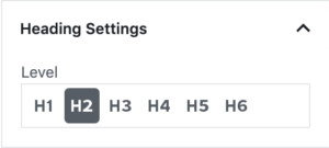
There are 6 headings that can be used to assign levels of importance to content on your page. H1 is the most important + H6 is the least. When you add a new Gutenberg heading block, you’ll see the options on the right side of your screen.
Before you get super excited + start making all of your text Heading 1, keep in mind that major search engines are smarter than you realize + you won’t fool them. Plus, your content won’t be very easy to read.
Whether you add headings while writing, or go back + edit afterwards, plan to use them in your content.
With most good WordPress themes, the title of your post will be an H1. Since Google watches for sites that overuse the H1 tag on pages/posts, stick with subheadings for breaking up your content.
Starting with Heading 2 (H2), break up your article into sections that make sense. Bonus SEO points for using your keyphrase in one of your subheadings! You can see how I used the H2 style to break up this lengthy post — skim for the bright blue headings.
Key phrases or parts within your sections could then be set to Heading 3. I like using Heading 4 for important sentences or phrases. If you want to use the final two options, go ahead! I find there’s enough variety with 4 options.
Break up large sections of content with headings to make everything easier to read/skim. A great rule of thumb is that you never want more than 300 words in a section without a subheading to break up the info. (Remember that these are suggestions, feel free to use a system that works best for you.)
Setting your headings
When typing in WordPress, you can add headings after the fact by changing the block. Or you can start with a heading block. Both ways work really well.
With your heading in its own line (paragraph block), click the paragraph symbol ¶ and select Heading from the options. You can then select any of the 6 heading sizes.
Or hit return to create a new block + type “/heading” to select the heading block right away. Repeat this step until all of your headings have been applied.
Keep in mind that heading styles are very specific to the theme you are using. If you don’t like the sizes, colors, or fonts of your headings, your theme might have an options menu that will allow you to update them easily. Otherwise, you or someone else can use the custom CSS option to style your headings.
Styling images in WordPress blog posts
Since you know your site visitors are skimming your content, imagine the impact an image has on how quickly they can process the information. Or, even better, think about how helpful an image (or more) is when they are scrolling through a sea of text shared on Facebook.
You could simply plop an image into your post, click publish + move on to something else. But that isn’t necessarily beneficial to you or your site visitors. In fact, it might hurt you if the image negatively alters the way the text displays or is the wrong size (too large or too small).
First, you’ll want to decide where the image needs to go within your content. Is it a text-heavy graphic that displays your post title with an icon or picture behind the text? Then you probably want that image near the top of your post. Is the image something that illustrates a point or makes a how-to post easier to follow? I’d suggest adding that image directly above the sentence that it ties to.
Now think about how you want the image + words to interact. Do you want a large image with no text on either side of it or do you want an image about half as wide as your content area with text on the left or right side?
Once you have that figured out, add an image block where you want it with the Gutenberg editor. You’ll either select an image from your library or upload a new one. Then set the alignment + size to match your layout plan. Sometimes placing the image + previewing the post helps with picking the right size.
Text styles
By now your blog post should be looking pretty awesome. You’ve got some headings to help your readers move through the content quickly, without missing the important stuff. There are visuals that flow with the text instead of interrupting it. The final detail that you’ll want to sort through is text styles.
Most bloggers + business owners use text styles with ease — bold, italics, underline, etc — and that’s awesome. But don’t forget about blockquotes, lists, + alignment too!
Don’t over-style your WordPress blog posts
With all of the options that WordPress gives you to style text, make sure that you aren’t using every one in each blog post you write. (There are some cases that it might work, but more often a couple of those options are enough.) The purpose of those styles is to draw attention to important elements or words, which… yup, helps your reader quickly get the important information.
Personally, I use italic + bold to express tone in my writing, lists for quick information + colors for links.
That’s not a hard rule, but it’s what guides most of my post styling decisions. You might find that bolding your links + adding color to them makes users more likely to click. Or, you might rely on italics as a way of adding notations to your posts. There’s no rulebook on this stuff, but using these features is beneficial to your blog + business.
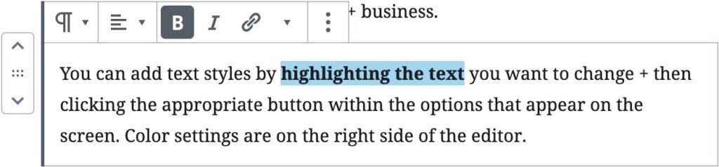
You can add text styles by highlighting the text you want to change + then clicking the appropriate button within the options that appear on the screen. Color settings are on the right side of the editor.
Before you click update
Remember when we were told to save our work on the computer before we finished “in case something happened”? This step is kinda like that. Before you click update, or publish, click the Preview button in the upper right to make sure that your changes, styles + additions make your post better.
There is nothing that beats seeing the post exactly how your visitors will see it to know if you are helping them.
It almost goes without saying that you know your reader better than I do. They might be the type that absolutely hates broken up paragraphs with larger font headings. But if you aren’t sure what they like, try some styling out + watch what your site data does. Are more links being clicked? Are your visitors staying on a page longer than before? With some info, you can then fine-tune your styling process even more.
Get started styling WordPress blog posts right now
To get comfortable styling your posts + pages, log into your WordPress dashboard right now + create a new post. Add a bunch of random text (use Meet The Ipsums if you need help) + start styling the heck out of it.
Apply all 6 headings to 6 lines of text. Create a blockquote, bulleted list + numbered list. Center one paragraph, then justify the next. Have fun + go to town. (Just don’t click “Publish” or you run the risk of your visitors seeing your madness.)
After you’ve applied all style options, click “Preview” to check out your styling choices in action. See exactly what Heading 3 looks like + ponder ways you can utilize it. Because the more you know….. *cue shooting star graphic + cheesy music*
You could also sign up for the completely free Learn how to use Gutenberg blocks ecourse. You’ll get a handful of emails over the next week + learn the basics of styling WordPress blog posts with Gutenberg and beyond.